


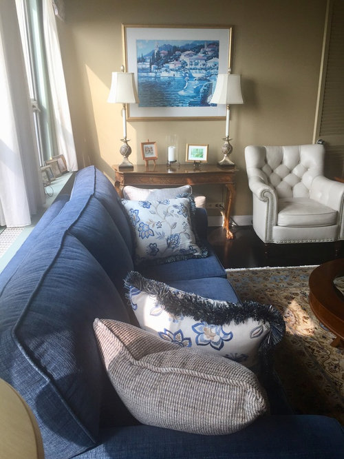
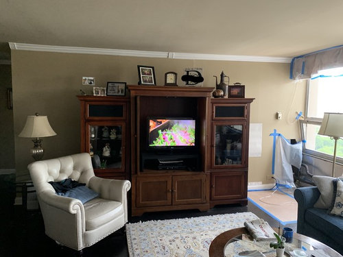
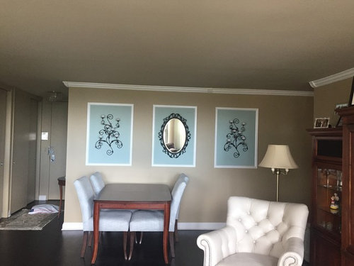
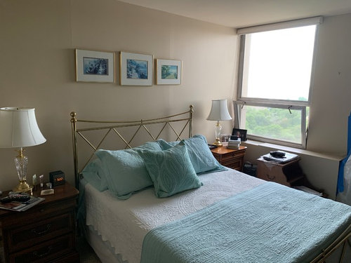
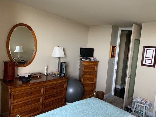
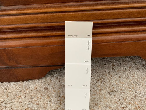
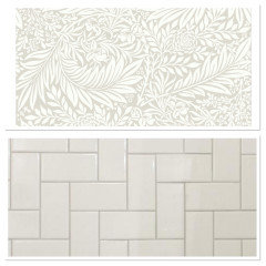
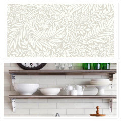
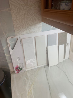
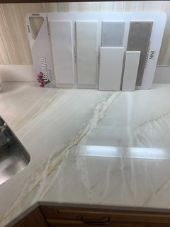
Time to Lighten & Brighten
Molly
4 years ago
Featured Answer
Sort by:Oldest
Comments (8.8K)

Molly
last monthMolly
last monthRelated Professionals
Birmingham Interior Designers & Decorators · Garden City Interior Designers & Decorators · Camp Springs Lighting · Manhattan Furniture & Accessories · Sioux Falls Furniture & Accessories · Billings Cabinets & Cabinetry · Livingston Cabinets & Cabinetry · Topeka Furniture & Accessories · Davidson Furniture & Accessories · Rockland Lighting · Parkland Fireplaces · Bella Vista Flooring Contractors · Petaluma Flooring Contractors · Sarasota Flooring Contractors · Waltham Flooring Contractors
Parker Murphy
last monthMolly
last month PRO
PROHome Interiors With Ease
last month
oportunitygreentea
last monthMolly
last month- PRO
Home Interiors With Ease
last monthlast modified: last month 
dsimber
last monthParker Murphy
last monthMolly
last month
glschisler
last month PRO
PROWindow Accents by Vanessa Downs
last month
kjoy1
last month PRO
PRODesign Interior South
last monthMolly
last month
cubby14
last month
DD Deco
last month
mary44
last month
liasch
last monthMolly
15 days ago
Nora Lambert
15 days agoNora Lambert
15 days ago- PRO
Home Interiors With Ease
15 days ago glschisler
15 days ago
RedRyder
15 days agoParker Murphy
15 days agodsimber
15 days agoMolly
15 days agoliasch
15 days ago PRO
PROFlo Mangan
15 days agoMolly
12 days agolast modified: 12 days agoParker Murphy
12 days ago
happyleg
12 days ago- PRO
Home Interiors With Ease
11 days ago RedRyder
11 days ago- PRO
Home Interiors With Ease
11 days agolast modified: 11 days ago Molly
11 days agoglschisler
11 days agocubby14
11 days ago- PRO
Home Interiors With Ease
11 days ago Molly
11 days agoliasch
11 days ago
piaa
11 days agolast modified: 11 days ago
justcallmepool
10 days agoMolly
10 days ago- PRO
Home Interiors With Ease
10 days ago - PRO
Home Interiors With Ease
10 days agolast modified: 10 days ago - PRO
Home Interiors With Ease
10 days ago DD Deco
9 days ago


Related Stories
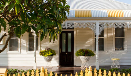
DECORATING GUIDESLighten Up — or Brighten Up — With Yellow
You can use this versatile color to create a buttery backdrop, add a zesty accent or make a bold design statement
Full Story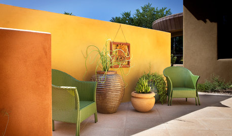
COLORGarden Color: Lighten and Brighten With Yellow
From mellow to far out, yellow plants and accent features can bring a taste of the sun close to home
Full Story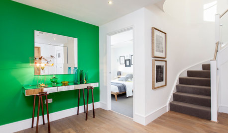
HALLWAYS10 Ideas for Brightening a Dark Hallway
Do you come home to a gloomy welcome when you open your front door? These solutions can lighten things up
Full StoryDECORATING GUIDES8 Decorating Tricks to Brighten a Dim Room
You might think to add white and provide adequate lighting, but you might not know about these other ways to lighten up a space
Full Story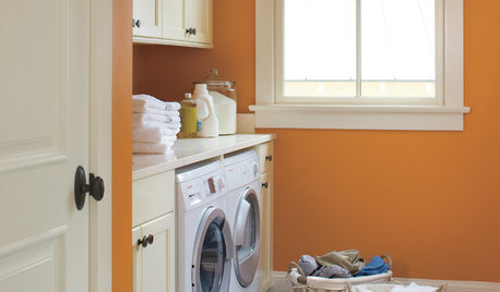
LAUNDRY ROOMS14 Ways to Lighten Your Summertime Laundry Load
Lessen up on washing and ironing chores, and make laundry time a livelier event, with these tips for summer and beyond
Full Story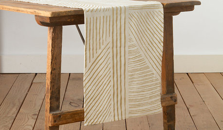
PRODUCT PICKSGuest Picks: Decor to Brighten a Wintry Day
Warm neutrals and a touch of glimmer make these linens, furnishings and accessories bright spots during cold times
Full Story
LIFE9 More Ways to Lighten Up Your Design
Summer is the Perfect Time to Relax and Have Fun with Your Decor
Full Story
LIFEAt-Home Cures for Autumn’s Time Change Blues
The long, dark evenings of late fall and winter can be daunting. Lighten them up with these tips
Full Story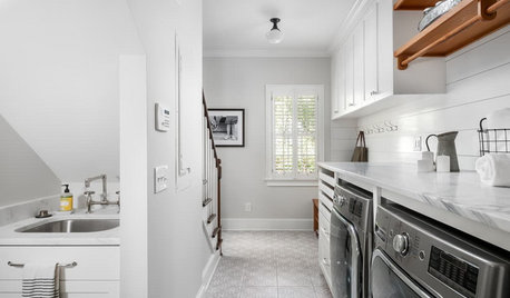
LAUNDRY ROOMSBefore and After: Remodeled Laundry Room Lightens Up
See how shiplap walls, marble countertops and a new glass door brighten this laundry-mudroom combo in Atlanta
Full Story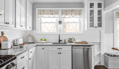
KITCHEN MAKEOVERSKitchen of the Week: Refaced Cabinets Lighten Up the Room
A designer saves her clients time and money by reusing what they already have in their 120-square-foot space
Full Story
ladma