Software
Houzz Logo Print
moediggs

Need help in my living room/ dining room area

12 years ago
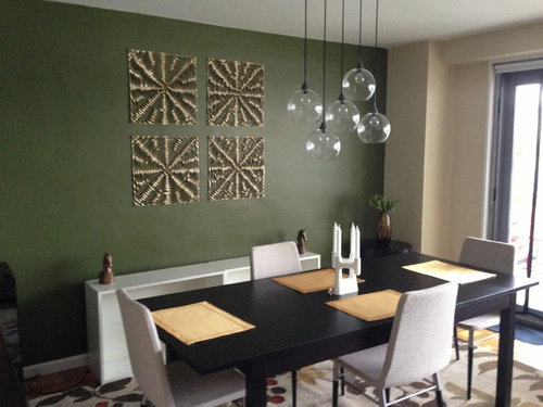
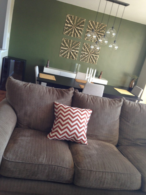
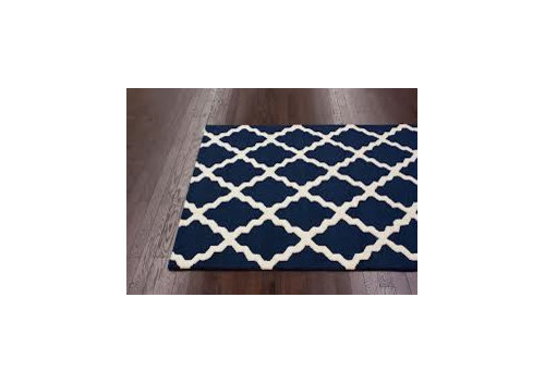
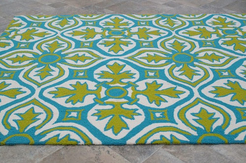
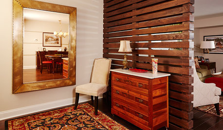
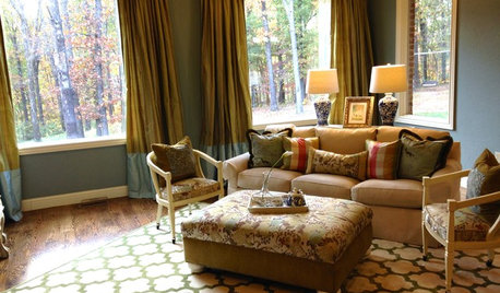
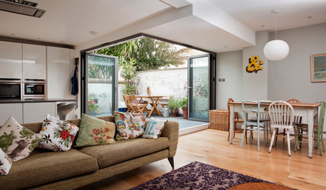
I currently have a green accent wall in my dining room and beige (almost yellowy) walls throughout my connected Living room/Dining room (attachment 1)- I HATE the beige and am starting to hate the green. I have brown couches that won't be replaced anytime soon (attachment 2). I was thinking of changing the accent wall into Old Navy (Benjamin Moore)- which I think would look great with the gold wall hangings all ready in place- and the rest of the walls in either a light gray (which I am afraid will clash with the brown couches) or Manchester tan. I would then do a Navy and cream area rug in the living room area (something like attachment 3) and either this bright rug (attachment 4) under the dining room table or leave the beige multicolored floral rug I currently have there. I am so frustrated and my boyfriend has pretty much tapped out of the process. Can someone please help!

Comments (276)

  • 12 years ago
    Sorry just realized you mean solitude in the hallway and kitchen wall and bunny gray everywhere else. At this pt I wish you could just see the space in real life! Lol. I'm so confused by all of this!
  • 12 years ago
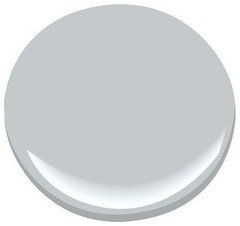
    Hi moe, Well, this might help you feel better - or it might make you feel worse! This is my extremely clumsy rendering of your room painted the light Gray. I'm basically finger painting, which is why it's so terrible! And to make things worse, it's the Sherwin-Williams app, so I had to substitute a different light grey. And I'm just terrible at finding paint colors on that app, so it's close but definitely not the same as Bunny Gray.

    But it gives you an idea of how that one wall would look. And I picked that pic because groveraxle had already inserted a grey rug (which is actually very beautiful!), so it's the closest I can get to your new look.

    I'll try one more pic, of the walls that could be painted the darker Solitude - again, it won't be pretty!
  • 12 years ago
    WOW thank you so much! I didn't even know you could do this on the Sherwin Williams website! I didn't even see Groveraxle's post with this rug in it- at least I don't remember seeing it- I feel like I'm in a rug tornado!

    SO this would be the wall you suggest Solitude on and then the hallway also, and just have the wall with the leaning bookshelf (the reading nook), the window wall and the half wall of the dining room leading into the kitchen all bunny gray?
  • 12 years ago
    No, I'm thinking this wall should be Bunny Gray too. I'm worried that too much of the darker colors will overwhelm the space. Initially, I pictured this wall in Solitude, but I also pictured a lot of white walls to offset the darker colors.

    So, now that I have you thoroughly confused! - I would do Bunny Gray (or similar) on the TV wall, window wall, reading nook wall.

    Then Solitude in a smaller amount - kitchen eating area and hallway wall that has the mirror. The rendering I did was my best approximation of the Bunny Gray.

    Have been looking for a close match to Solitude on Sherwin-Williams site and not having any luck (I do wish I had fan decks!). For some reason, Ben Moore doesn't have a visualizer app, and I am much more familiar with their colors!

    Anyway, life calls for now, so I might take a crack at it later on!
  • 12 years ago
    Thank you again so much for all of your help, you are the little light keeping me in all of this!!! I am liking the idea of the bunny gray in more of the space with the hint of solitude. Going to try some poster boards tonight and see what happens!

    Thanks again so much for everything!
  • 12 years ago
    No problem, moe. It is a lot of fun - armchair decorating, that is! Really keeps the creative juices going!

    And don't ever feel that we are losing patience with you. It's not like that - and we have all been there, taking years sometimes to find the perfect rug or painting!

    You should see some of the dilemmas on Houzz - 500 comments and counting. And three days worth of exchanges just trying to decide whether to move a vase 3" to the left LOL
    moediggs thanked karemore55
  • 12 years ago
    Thank you again, that made me feel so much better! I have all the faith in the world that it will be gorgeous, but like you said it can just be frustrating!

    And again, I really appreciate all of your help.
  • 12 years ago
    last modified: 12 years ago
    hi moediggs,Karemore55 is really looking after you so all i can say is have courage and paint!!its going to look really nice!! are you going to use the old navy color and the solitude or is it going to be a choice between them for the darker bleu you want to use? here is some DUTCH courage for you ..
  • 12 years ago
    Hahaha, Carole! As long as she doesn't drink it WHILE she's painting lol!

    I had you pegged as French since you kept saying bleu! So, it is also blue in Dutch?
  • 12 years ago
    Thank you Carole for the 'shot of courage' but I have to admit I am still really confused with all the choices!!!

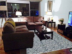
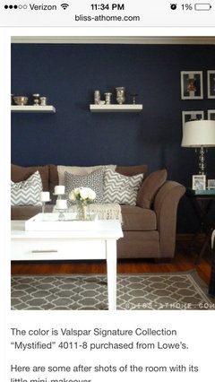
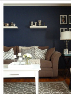
    I did some searching online tonight for some options of colors with navy accent walls and I just found this picture online and I think it looks a lot like what we've been discussing- the couches are even sort of like mine (I'm loving the trellis gray rug with the navy) and although my dining room would still be in between the couch and wall I'm thinking it's really going to look great. My only prob is I'm not loving the idea of three diff colors in the space (navy bunny gray and solitude) I still wanna do the navy-( I saw the aura matte finish and really prefer it to the shine of the egg shell). So now I am looking for a color I can do the rest of the whole space in and perhaps just do the one kitchen wall In the solitude. Perhaps the bunny gray throughout or another gray/blue suggestion not as deep as solitude? In this pic they do a darker beige on the side walls which I don't love. But I'd still like to be able to use the gray rugs and accent pillows as well as incorporate more navy and maybe another color (doesn't have to be the rust, I've decided I can scratch the covers I have if need be).
  • 12 years ago
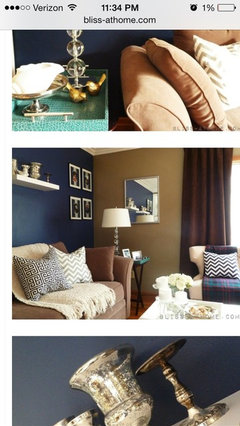
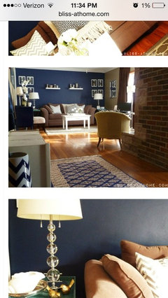
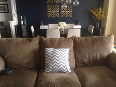
    Two more views.
  • 12 years ago
    Hi moe, I think the thing to do is go ahead with your navy wall, and order your pillows and rugs. Then wait until you have these new pieces in your space before picking out the color for the other walls.

    Yes, just one other color is definitely going to work, especially in a small space. And way less decisions to make - bonus! It will be much easier to pick this second color once you have the navy wall and these new accessories in place. You will be able to pick a light Gray that works well with these new colors, which will be much easier (and less stressful) than what you are trying to do now.

    What is the expected delivery date of your new rugs? And the pillows?
  • 12 years ago
    last modified: 12 years ago
    Moediggs,i like the pictures you have found in your search,it shows that the choices you are making are looking good together,and as Karemore55 has said,take some time for the next step,do the paint and new accessoires then start looking for the rugs,and i think you are right in scaling back the blues!! navy first,cant wait to see it on the wall.....

    hi karemore55,excuse my spellingmistakes,am a confused european...i am Dutch,partner is English and living in France!!!and yes,the Dutch have bleu/blauw,the stonebottle is a Delftblauw,like chinaware...
  • 12 years ago
    Hahaha, Carole, I know what you mean about the language confusion. I am Canadian and speak a tiny bit of French that I learned in school centuries ago. We spent a couple of months in Mexico this winter, and everytime I attempted some Spanish, it came out with a French accent. And the Spanish word for three ALWAYS came out trois!

    Then, I met a couple of handsome young men from France down there and tried to impress them by saying "I am from Canada" in French. Only it came out Je suis dans Canada, which is I am IN Canada.

    How people speak multiple languages and keep them straight, I'll never know lol!
  • 12 years ago
    I love the green wall with the gold plaques.
  • PRO
    12 years ago
    Hi Moediggs, Finally taking a look at what you have posted. Seems like you have gotten alot of feed back:) I do like the idea of painting the dining room wall a navy and I believe I sent you the name of the navy in my pic.? As far as the paint colors for the rest of your apartment Prather paint makes a paint called C2. One color that I love is Shiitake # C2-410. It would look great with your furniture and navy accent wall. The trim color would be Benjamin Moore Dove White. I like to paint the walls in an eggshell finish, trim in high gloss and ceilings in flat paint. Unless I am looking for drama and then I paint the ceiling or a wall in a high gloss. If you are looking for rugs find ones for both the dining room and living room that will pull all your colors together. You could do a all over pattern and a geometric or two geometrics that don't clash. Then have fun with your throw pillows. I like to tell my clients that items that are costly you should really love and they should be timeless in style and versatile. Remember that while buying things from retail stores make sure you mix it up as you don't want your home to look like everyone else or a stores display.
    moediggs thanked Jennifer Harris Interiors
  • 12 years ago
    last modified: 12 years ago
    Thanks so much for the help Jennifer!

    I wanted to send a little update- I haven't been able to do as much as I would have liked so far- just have been crazy at work and caught not only a stomach bug that was going around NYC but also the flu!!! Just about back to normal now, thankfully.

    I was kind of nervous about committing to a navy paint because I want to make sure I absolutely love it before painting- and the thought of having to re-paint was just too much! So, I got samples of a few different Navy paints that I liked including Old Navy by Benjamin Moore, Mystified by Valspar and Naval by Sherwin Williams and finally decided on the Naval paint by Sherwin WIlliams. They were all sooo similar however for some reason I just preferred the Naval (I attached a pic of it below that I found online). I also purchased the flat paint- I just kind of preferred the dullness to it without any shine esp with the white cabinet.

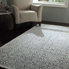
    I also purchased the rug below although I'm not sure if I will be putting it in the LR or DR- I'd like to see it actually there first. I haven't decided on a second rug just yet but have been looking at other gray and white options. I also have not decided on a complimentary color paint for the other walls- I am going to hold off as Karemore (hi!) suggested and get the rugs in place before painting again. I really just don't want to rush through this all and then be disappointed.

    Also have been searching around for pillow covers. I did order one of the chevron gray below just to see how it would look and pull the rug in but plan on mixing it up a lot more with patterns and colors.

    Hoping to have some real pictures for your shortly!!!
  • 12 years ago
    I believe I've showed this picture before but it really reminded me of the color of my couches and floors and the gray idea that Kare had- I would like to incorporate the navy into my throw pillows also and perhaps some multi colored pillows just for some pop- but I have referred back to this picture a few times to remind myself that it will work.
  • PRO
    12 years ago
    Yes, but see how the rug is simular in color to the sofa. You will have to balance the two colors out and then add your pop of color.
  • 12 years ago
    Yeah that trellis rug is more taupe. That's not what I purchase. I purchased the gray rug above.
  • 12 years ago
    Hi, Moe, Good to hear from you! These things do take time, and you are absolutely right to not rush. Sounds like the rug hasn't arrived yet, and that will be your next big determiner for color direction.

    So, we will patiently wait for that rug to arrive! It's beautiful, btw. I'm not sure where I'd put it either. I'm thinking the DR because of that pretty pattern, but you will know once you actually have it in your space.

    I'm glad you're on the mend. Spring is almost upon us, so those nasty flu bugs should be history real soon!
  • 12 years ago
    Oh, just want to point out - that pic of the rug you ordered? You see that pale blue-grey wall in the background - this could still be a contender for complementary wall color. But we'll cross that bridge when we get to it!
  • 12 years ago
    I am glad you are still committed to the navy blue. I think that will look great in your dining room.
  • 12 years ago
    Thank you ladies! Rug is supposed to arrive this week and am bound and determined to get that navy wall done! Will be back with pictures! Thanks again!
  • 12 years ago
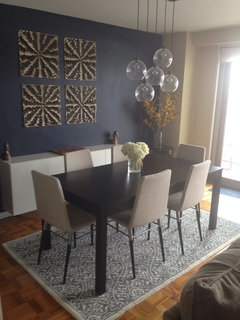
    Finally finally got the wall painted and I love it! I feel like the panels stand out so much better on the navy. Love the gray and white rug however it is a bit small- we even took a leaf out of the table to make it fit for now. I'm going to order something bigger in a similar gray and white and prob move this one into the living room. Now just to repaint the greenish beige walls that no longer match! So glad i went with the navy though! And the gray and white so brightens the apt!
  • 12 years ago
    Love it!
  • 12 years ago
    Oh ya, just gorgeous! I'm so glad you like it, moe. And it is a pretty rug, so at least you get to keep it. Your DR rug should be big enough that all the chairs will be completely on it when people are seated at the table.

    Yes, round two - painting the rest of the space!
  • 12 years ago
    last modified: 12 years ago
    All this room needed i.m.o was an important, large and colourful painting instead of the gold painted squares. The room would instantly come alive. All the shapes in the room are sharp lines and the squares are not giving it any life. Abstract large painting is what I would try or even in the style of Georgia O'Keefe.
  • 12 years ago
    @gustarygers, We must be looking at two different spaces! In the dining room alone, I see round funky lights, a slight rounded back on the chairs, free-form sprigs of forsythia, and a swirly pattern in the rug.....
  • 12 years ago
    I think it looks great! Love the navy.
  • 12 years ago
    I love the navy. It looks amazing.
  • 12 years ago
    Fantastic!
  • 12 years ago
    Thanks so much ladies, I'm so glad it
    finally got done and couldn't be happier. Like I said I didn't hate the green but I just find these colors so much easier to work with, and I love the flat paint in here! I felt quite limited before and now I don't at all. Plus the space just feels so much more modern and bright. I'm going to try to find another gray rug tho, taking cares sizing advise into account (thank you as always!) and am going to purchase some samples for paint to cover the beige. I was thinking more of a white with a very very light gray tone, any thoughts or suggestions? I was also thinking I may do the one wall in the kitchen (with the butcher diagrams framed) a darker charcoal. Plz tell me if you think I'm going way too gray here! It's a fine line between nice and overdoing it! If also like to buy some navy pillow covers to play off the wall and bought one gray chevron which I like so prob will get another.
  • 12 years ago
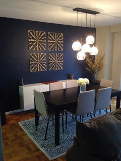
    One more pic: this is the room at night, the navy totally changes but I still love it!
  • 12 years ago
    Stunning!
  • 12 years ago
    Hi Moe, I think a grey white with warm undertones would be perfect with the navy. I think you would be really happy with that combination.

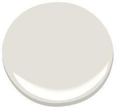
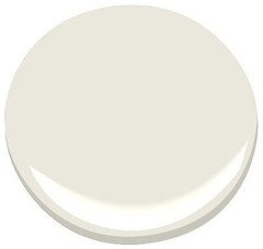
    Can't remember if I have tried to push this color on you yet, but it is Ben Moore Classic Gray. On my monitor it looks like a good fit, and I have seen this color in an office that was done up with cobalt blue and copper accents, and it was stunning., it's a soft, chalky grey that reads more as white as it is very light. It's a very calming, serene color. Having said that, I wasn't sure exactly which navy you ended up using, so this might not be the perfect grey-white for your space.

    The other possibility is Dove Wing, similar to Classic Gray but a bit whiter. Has more khaki undertones, whereas Classic Gray's undertones are quite complex and hard to read.

    Showing them below with Old Navy - is that the navy you went with?
  • 12 years ago
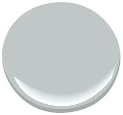
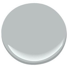
    About your kitchen wall - since it is next to your navy wall - and I assume from certain points you can see both spaces at once? - I think a dark grey might compete with the navy, both being dark and dramatic colors. I could see a medium to light grey working, though. Here are a few ideas below - does something like this appeal to you?

    Posting Winter Lake, Winter Solstice and Silver Half-Dollar:
  • 12 years ago
    Thanks so much Kare! I always appreciate your suggestions! The navy I went with was the Sherwin Williams Naval. I am going to look into the other colors you suggested and will check back in. But I agree, I think a light gray with a whiter undertone would be best. I really would like to keep it light and airy with just the navy being the only dark focal point. I also love the idea of a medium shade of gray for that one wall in the kitchen which can be seen from the LR and DR. Oh fun, more paint samples lol. I will say that the fact that I persisted with the navy and it worked so well is motivating me to stick it out until it's all done! I appreciate everyone's help and encouragement!
  • 12 years ago
    hi moediggs,love the room,the navy really looks good!!;-)keep going and keep us posted....
  • 12 years ago
    I actually like the walls in your pictures and think going with too much grey will make the floors look totally out of place. Can you go with something with at least a touch of brown in it like antique white, oyster, tan, carmel? All look good with navy.
  • 12 years ago
    sorry to hijack the discussion but victorianbungalowranch if you see this message THANK YOU Over a year ago you commented on my home's exterior (on a totally unrelated question) and said some railing that was obscuring the front steps of my 1908 Four Square had to go. I finally got rid of them and my house looks amazing!
  • 12 years ago
    Hahaa no worries at all!
  • 12 years ago
    last modified: 12 years ago
    Wow, nice to know I was helpful! I serve on my local Historic Preservation Commission in a small town where preserving old stuff is considered impractical and too expensive. I try to be realistic, but sometimes I feel like a voice in the wilderness.

    Can you post some before and after shots of the exterior. Now I'm totally curious.
  • 12 years ago
    Thanks you victorianbungalowranch! I am going to look into those colors as well. Def want to make a slow and steady choice bc I def don't want to have to paint again anytime soon
  • 12 years ago
    Yeah, painting isn't my favorite activity either, and it can look so different on the wall.
  • PRO
    12 years ago
    so......what I would like to know is...where did you get the dining room light fixture!
  • 12 years ago
    Sorry Northshore I'm just seeing this now. We got it at CB2!
  • PRO
    12 years ago
    thanks! I love it
  • PRO
  • PRO
    11 years ago

    hello! i have totally enjoyed reading this post...what a ride! you have done so much and so well, and your decor style blossomed before my eyes..!! it was like you knew what you wanted.?. u just needed miss moediggs to help u believe it all into existence.. :) don't u love houzz !! i had a couple ideas too? i thought the DR buffet table could use meatier end pieces? 3 or 5 0r 7 chunky candlesticks? (uneven numbers is a design rule of thumb). a mirror would look great in the room too...i was also wanting to suggest 2 other things.. what do think about picking a metal? silver or gold...chrome? and b industrial ? or do that real soft gold that's out now? that would b fabulous.!! because u have the coastal vibe happening :) lastly? adding in a POP of color! yellow, red, orange? i know u have the navy wall and the grey... but why not add in a floral? hell!! chevron, floral, polka dots !!! it all works!!...just mix up the size of the patterns..and always keep colors in the same tonal family..!!! thanx for reading and i enjoyed ur journey