


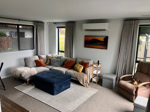
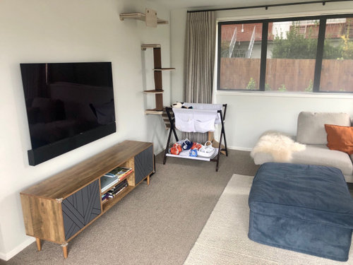
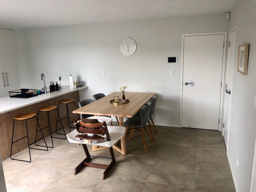
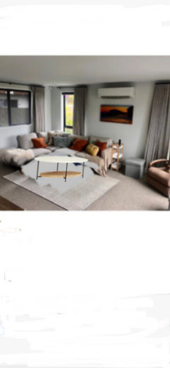
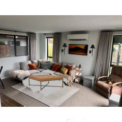
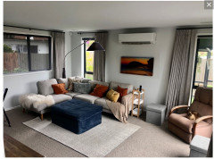
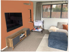
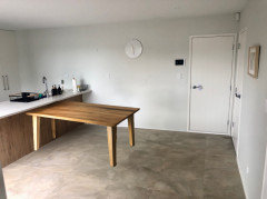
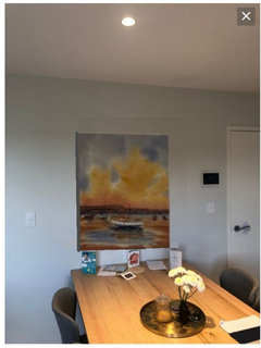
How to salvage too many shades of neutral in lounge and dining room?
Laura G
13 days ago
Featured Answer
Sort by:Oldest
Comments (22)

Laura G
13 days agoRelated Professionals
Mount Holly Cabinets & Cabinetry · New Port Richey East Kitchen & Bathroom Remodelers · Corsicana Tile and Stone Contractors · New Providence Interior Designers & Decorators · Lafayette Kitchen & Bathroom Designers · Moraga Kitchen & Bathroom Designers · Fort Wayne Furniture & Accessories · Lebanon Furniture & Accessories · Hoboken Furniture & Accessories · Wakefield Furniture & Accessories · Pacifica General Contractors · River Edge General Contractors · Avocado Heights General Contractors · Camarillo Furniture & Accessories · Fallbrook Furniture & Accessories PRO
PROJAN MOYER
13 days agolast modified: 13 days ago
freedomplace1
13 days agolast modified: 13 days agokandrewspa
13 days agofreedomplace1
13 days agolast modified: 13 days ago PRO
PROBeverlyFLADeziner
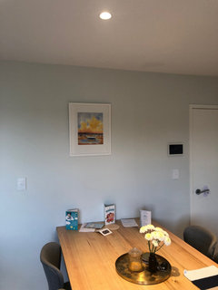
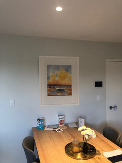
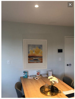
13 days agoLaura G
13 days agoPaul F.
13 days agomarmiegard_z7b
13 days agoLaura G
13 days agoLaura G
13 days agomarmiegard_z7b
13 days agoLaura G
13 days agoLaura G
12 days agoPaul F.
12 days ago- PRO
BeverlyFLADeziner
12 days ago Laura G
9 days ago
kazzh
9 days agomarmiegard_z7b
9 days agoLaura G
9 days agoHU-570180435
8 days ago


Related Stories
KIDS’ SPACESWho Says a Dining Room Has to Be a Dining Room?
Chucking the builder’s floor plan, a family reassigns rooms to work better for their needs
Full Story
DECORATING GUIDESRoom of the Day: Romancing a Maine Dining Room
Glossy paint and country-style furnishings make a 19th-century interior an affair to remember
Full Story
LIVING ROOMSLiving Room Meets Dining Room: The New Way to Eat In
Banquette seating, folding tables and clever seating options can create a comfortable dining room right in your main living space
Full Story
REMODELING GUIDESRoom of the Day: Antiques Help a Dining Room Grow Up
Artfully distressed pieces and elegant colors take a formerly child-focused space into sophisticated territory
Full Story
DINING ROOMSColor Feast: When to Use Gray in the Dining Room
The right shade of gray pairs nicely with whites and woods to serve up elegance and sophistication
Full Story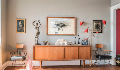
DECORATING GUIDES10 Ways a Red Lamp Shade Can Sass Up a Room
Energize a neutral palette, refine a rustic look ... where a red shade goes, liveliness is sure to follow
Full Story
DINING ROOMSPick the Perfect Dining Room Storage
Hutches, credenzas, sideboards, bookcases ... with so many options and styles of dining room storage, this guide can help narrow the field
Full Story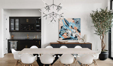
DINING ROOMSNew This Week: 8 Stylish Dining Rooms
The formal dining spot is making a comeback. Get yours ready for entertaining season with these inspiring designs
Full Story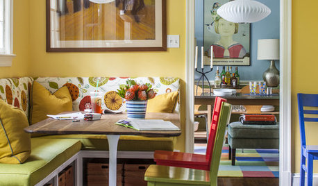
COLORColor Feast: 6 Deliciously Uncommon Dining Room Color Combos
Give your mealtime space a generous helping of hues paired in a most refreshing way
Full Story
DECORATING GUIDESColor Feast: Yes, You Can Use Blue in the Dining Room
The sky's the limit for beautiful blues in your home's dining spaces; here's how to make it work
Full StoryMore Discussions


Paul F.