


Houzz Tour: Boston Pied-à-Terre Designed for Evenings
A designer found on Houzz infuses a condo with a sultry vibe inspired by supper clubs and luxe boutique hotels

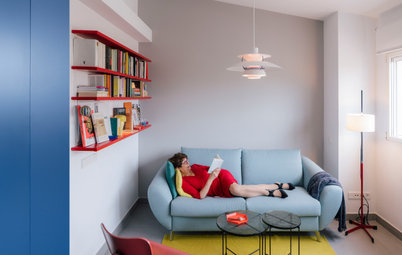
“The beauty of this condo was that it had 14-foot ceilings. The challenge was that they created some unusual proportions,” interior designer Lisa Tharp says. The home is in a former university building in the heart of Boston that had just been converted to condos when Tharp’s clients hired her. Large classrooms had been divided into separate rooms, which resulted in some tall narrow spaces.
The clients found Tharp on Houzz years ago and asked her to transform their more traditional home outside Boston. This time around, they were looking for something different. “This was to serve as their pied-à-terre — as a base for weekends in Boston, for staying in the city after plays or concerts or a day at the museums,” Tharp says. “That meant that they’d mostly be spending evenings here, so we wanted to go for a luxe hotel suite or supper club kind of feeling.”
The clients found Tharp on Houzz years ago and asked her to transform their more traditional home outside Boston. This time around, they were looking for something different. “This was to serve as their pied-à-terre — as a base for weekends in Boston, for staying in the city after plays or concerts or a day at the museums,” Tharp says. “That meant that they’d mostly be spending evenings here, so we wanted to go for a luxe hotel suite or supper club kind of feeling.”
Tharp also designed the sofa. Its low-slung form emphasizes long, horizontal lines, in contrast with the verticality of the ceilings and drapes. She used jewel tones throughout the pied-à-terre. “In the living room, I used the cooler end of the color spectrum in a playful way,” she says.
A large piece of art over the sofa stands up to the height of those 14-foot ceilings, helping to bring them down to human scale. “When shopping for art I especially loved the fundraising sale at the School of the Museum of Fine Arts,” Tharp says. “You can find a lot of emerging artists as well as student work there. It raises money for the school and it’s a great way to source locally.”
This piece, by artist Daniela Rivera, is called Andes Inverted #1 and is oil paint and soil on canvas. “This is a very powerful piece about the impact of Chilean mining on communities, the earth, on health and on well-being,” Tharp says. “I thought it was apropos for the house, and my clients loved it.”
Browse media cabinets in the Houzz Shop
Tharp always designs and sources with sustainability and health in mind. “We tried to source locally or had things made locally whenever possible,” she says. “And when we couldn’t find something, we tried to find vintage pieces.”
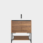
A good example of the former is the deep blue lacquer, walnut burl veneer and brass armoire that Tharp designed. It not only stands up to the height of the ceilings, but it also hides the TV. “The design of this home has strong moments of color,” Tharp says. A great example of sourcing vintage is the 1970s leather lounge chair and ottoman by Saporiti Italia.
A good example of the former is the deep blue lacquer, walnut burl veneer and brass armoire that Tharp designed. It not only stands up to the height of the ceilings, but it also hides the TV. “The design of this home has strong moments of color,” Tharp says. A great example of sourcing vintage is the 1970s leather lounge chair and ottoman by Saporiti Italia.
This is the view from the kitchen and dining area into the living room. Another great vintage find was the 1950s Danish modern floor lamp with triple adjustable gooseneck heads. Tharp outfitted it with new cylindrical parchment shades.
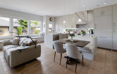
The biggest challenge within the layout was the dining area, Tharp says. “They didn’t really have one — there was just a table and chairs plopped into a high-traffic area between the kitchen, the living room and the bedrooms.” So she set out to make that spot feel more like an intentional space. Cozy supper clubs, classical loggias and the structural column to the left of the mirror inspired a solution.
Like the art in the living room, the large mirror helps bring the ceiling height down to human scale. It also reflects the light from the living room and primary bedroom windows.
The sculptural Zettel’Z pendant light by Ingo Maurer also brings the ceiling down. Those familiar with this fixture are used to seeing it composed of blank and printed white paper. “We decided to go in the opposite direction and replace them with large black pieces,” Tharp says.
Shop for a modern chandelier
Tharp’s own Radius table inspired the idea of using curves in the dining area. She defined a sheltered dining nook and a bedroom hallway behind it by adding columns to curve around a custom banquette. “While classical loggias inspired me, this version of their columns is a reduction, resulting in sleek architecture,” she says. “And the spacing between them allows the dining room to share that precious natural light that comes in along the bedroom hallway. FBN Construction did a great job of attaching the columns to the floor and ceiling and figuring everything out.”
The columns also add texture to the space. Tharp had the artists at Arteriors Designer Finishes paint them in a custom pattern inspired by the early days of the modernist movement. She had faux shadow lines added at the top.
Find a local general contractor
The columns also add texture to the space. Tharp had the artists at Arteriors Designer Finishes paint them in a custom pattern inspired by the early days of the modernist movement. She had faux shadow lines added at the top.
Find a local general contractor
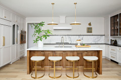
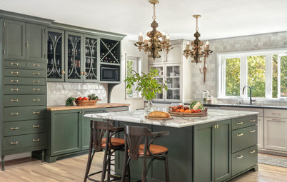
Because the space had just been converted to a condo, the kitchen was brand-new. “We tried to replace as little as possible to keep this project sustainable,” Tharp says. The one major change in here was removing a row of upper cabinets that were not needed in a pied-à-terre. They were donated to Habitat for Humanity and replaced with open shelving that provides display space.
Tharp also added the new taupe-y brown color to this wall. “The kitchen was all white before, which did not feel very evening or sultry,” she says. One exception to her local-materials rule was the Venetian tile backsplash. “This tile has a translucency to it and it absolutely glows at night,” Tharp says. Adding to the evening-vibe glow is a small table lamp placed on the counter — no need to flick on all the bright lights in here when grabbing a cocktail.
Tharp added another jewel tone into the space by bringing in deep raspberry velvet bar stools she designed herself. “These look like they have been molded and folded from one piece, so I named them Fold,” she says. The curve of the backs brings in Art Deco flair.
This is the primary bedroom. “This room was all about the hush — it’s a quiet respite after an exciting night in the city,” Tharp says. “I designed it to be very beautiful and sensuous to the touch.” The monochromatic rose tones make it quiet and warm.
This room also enjoys high ceilings and tall windows. Tharp added significant crown molding to bring the ceiling height down. “This style of crown molding was inspired by details on the exterior of this stone building,” she says. She also added a light with a long, vertical silhouette. It’s a vintage 1960s Carlo Nason Murano glass tube fixture.
The chair in the corner provides a spot to sit and relax. It’s an Art Deco-inspired style with a rosewood frame. The bench, designed by Tharp, is walnut with brass inlay and vegan leather upholstery.
“Everything in here is very soft and comforting to the touch,” Tharp says. The bedding is silky, the drapes are fine wool and the rug is heavily padded. And the wallcovering is silk and abaca grasscloth. Its horizontal lines also help mitigate the verticality of the high ceiling.
The designer nestled the bed into the room by designing an upholstered headboard that spans the entire wall. She also designed the space-saving wall-mounted nightstands and covered them in a color that matches.
The artwork is by Timothy Kadish. “It’s oil, acrylic, sand and concrete on canvas,” Tharp says. “It was a great sharp color contrast and a juxtaposition to all the softness in the room.”
Wall-mounted sconces have faceted porcelain shades that provide light for reading and add a lovely glow to the room.
The bathroom vanity, mirrors and lights were already here as part of the condo conversion. “My clients and I agreed about not wanting to be wasteful, so we decided to work with what was here,” Tharp says.
That didn’t mean they couldn’t completely change the feel of the space. “We wanted to create the feeling of opening the door to a surprise,” Tharp says. “I told my clients we should have some fun with fuchsia in here and they were game.” The wallpaper, August by Trove, features portraits of past queens of Denmark, Japan, Greece, Prussia, Italy and India. Its gray background ties in with the thick natural stone countertop.
That didn’t mean they couldn’t completely change the feel of the space. “We wanted to create the feeling of opening the door to a surprise,” Tharp says. “I told my clients we should have some fun with fuchsia in here and they were game.” The wallpaper, August by Trove, features portraits of past queens of Denmark, Japan, Greece, Prussia, Italy and India. Its gray background ties in with the thick natural stone countertop.
The second bedroom had a smaller footprint, which made the high ceilings seem even more out of proportion. “It felt like an oversized elevator,” Tharp says. She mitigated the proportions by adding a picture rail three-quarters of the way up the wall and bringing a glossy deep teal wall paint up to meet it. This gives the eye a place to rest and makes the room feel cozier. Large paper lanterns also help with the ceiling height.
“We really glossed these walls — it’s so beautiful and reflective and glows at night,” Tharp says. “It feels restful to be immersed in the jewel-toned palette in here. It invites you to slumber deeply.” Speaking of inviting, the door to this bedroom is also painted the glossy deep teal. Look to the first photo of the dining area to spy it in the back corner.
“We really glossed these walls — it’s so beautiful and reflective and glows at night,” Tharp says. “It feels restful to be immersed in the jewel-toned palette in here. It invites you to slumber deeply.” Speaking of inviting, the door to this bedroom is also painted the glossy deep teal. Look to the first photo of the dining area to spy it in the back corner.
To best fit a queen bed in the space, Tharp placed it in the corner and wrapped it in an L-shaped honey oak headboard. “This room also has a TV, so we have pillows in the closet they can bring out to use this like a daybed for watching TV,” she says. This is where the homeowners’ kids hang out and sleep when they have fun city weekends with their parents.
Sumptuous velvet bedding in a deep rust contrasts with the deep teal. The triple wall sconce saves space and adds an Art Deco-inspired element.
None of the paintings the design team had come across while art shopping seemed quite right for the guest room. Then Tharp saw a painting her artist daughter, Fia Tharp, had recently completed. She knew it was perfect for the room, and her clients agreed.
“The honey-colored oak on the bed has a midcentury feel,” Tharp says. She went more Art Deco with the nightstand — it’s a 1930s Swedish bar cart. Blu Dot’s Punk lamp tops it, another midcentury-modern-style touch.
Now the condo feels swanky yet comfortable. Its focus on large swaths of color, curves and soft materials makes it inviting for evenings in the city.
More on Houzz
Tour more homes
Hire a local design pro
Shop for your home
Now the condo feels swanky yet comfortable. Its focus on large swaths of color, curves and soft materials makes it inviting for evenings in the city.
More on Houzz
Tour more homes
Hire a local design pro
Shop for your home


House at a Glance
Who lives here: This is the pied-à-terre of a couple with school-age children
Location: Boston
Size: 1,400 square feet (130 square meters); two bedrooms, two bathrooms
Designer: Lisa Tharp Design
Builder: FBN Construction
This photo of the living room illustrates the issue of scale. “These rooms are generous, especially for a condo in Boston,” Tharp says. And the ceilings are so high that they didn’t even fit into this photo’s frame. While this isn’t a bad problem to have, it’s nonetheless a design challenge.
Tharp used long wool drapes to soften the windows and she continued the cozy feel with a soft lavender wool rug. Tharp designed the rug, with its raised capsule-shaped design, in collaboration with The Rug Co. Capsule-like shapes and curves pop up throughout the home, providing soft contrast to the long, vertical lines in the condo.
Tharp and her team mixed Art Deco and midcentury modern inspirations. For example, the jewel tones and curves nod to Art Deco, while the use of wood, such as on the walnut coffee table with brass inlay and smoked glass top, channels midcentury modern style. Neither style dominates, resulting in a fresh and sophisticated look.
Find an interior designer on Houzz