


Thoughts on changes to this front elevation?
Tolla
9 days ago
last modified: 9 days ago

Featured Answer
Sort by:Oldest
Comments (11)
Related Professionals
Saratoga Springs Kitchen & Bathroom Designers · Dallas Furniture & Accessories · Hoffman Estates Furniture & Accessories · Waianae General Contractors · Westminster General Contractors · Carlisle Furniture & Accessories · Evanston Furniture & Accessories · Detroit Furniture & Accessories · Port Huron General Contractors · Orem Flooring Contractors · Corpus Christi Architects & Building Designers · University Park Home Builders · Hollywood Painters · Lehi Painters · Greenville General Contractors
chispa
9 days ago PRO
PROCelery. Visualization, Rendering images
9 days agolast modified: 9 days agoJ Sk
9 days agolast modified: 9 days ago- PRO
Celery. Visualization, Rendering images
9 days ago K Laurence
8 days ago


Related Stories
TRANSITIONAL HOMESHouzz Tour: Change of Heart Prompts Change of House
They were set for a New England look, but a weekend in the California wine country changed everything
Full Story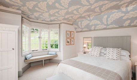
CEILINGS11 Surprising Ways Wallpaper Can Elevate Your Ceiling
Wallpaper isn’t just for walls. Use it on the ceiling to change the look and mood of a room
Full Story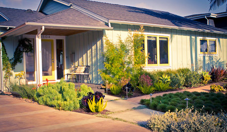
FRONT YARD IDEASBefore and After: See 5 Dramatic Front Yard Updates
These makeovers, including a parking-strip farm and an entertaining hub, elevate the typical front yard
Full Story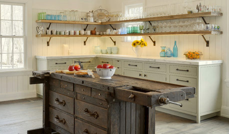
KITCHEN ISLANDSNew This Week: 3 Kitchen Island Ideas You Haven’t Thought Of
See how a custom, personalized feature on an island can change your kitchen’s look, feel and function
Full Story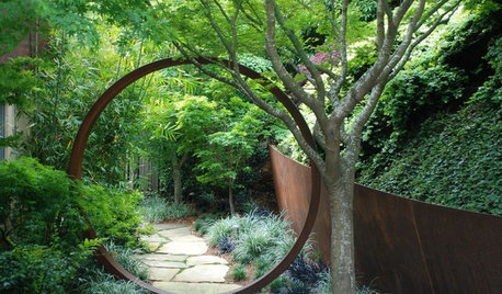
ARTElevate the Garden With Understated Art Pieces
These 10 simple, thoughtful objects bring beauty and a sense of place to the landscape
Full Story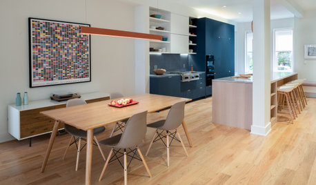
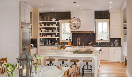
KITCHEN MAKEOVERSKitchen of the Week: Cooking Is Front and Center in This House
Architects flip a floor plan to suit a young family’s lifestyle and clean-lined, colorful style
Full Story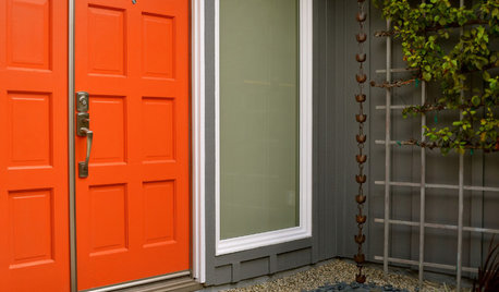
MOST POPULARHow to Choose a Front Door Color
If choosing a door paint isn't an open-and-shut case for you, here's help
Full Story
HOUZZ TOURSHouzz Tour: Major Changes Open Up a Seattle Waterfront Home
Taken down to the shell, this Tudor-Craftsman blend now maximizes island views, flow and outdoor connections
Full Story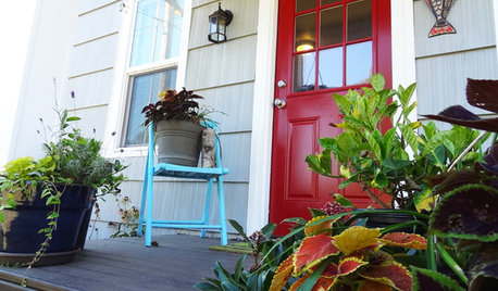
CURB APPEALDIY Painting Project: A Colorful Front Door
Give your entrance a notice-me new hue to make it inviting and energizing for fall
Full Story
KITCHEN ISLANDSNew This Week: 5 Kitchen Island Shapes You Haven’t Thought Of
Going a bit abstract with your island design can get you more room for seating, eating, prep and personal style
Full Story


Celery. Visualization, Rendering images